Designing for the
people actually
using it.

I'm Maisie, a UX / product designer in NZ. I bring research depth and visual craft to problems that deserve more than a functional fix. Playful on the surface. Well thought out underneath.

Maisie Braem

Selected work

The work.

View all →

02 / How I work

Playful, but thoughtful underneath.

01

Research-first

Most of my projects start with interviews and a thematic read. I trust the brief to change once I've actually spoken to the people it's for — that's usually where the real problem is.

02

Visually considered

Cohesive systems over one-off screens. Typography, hierarchy and tone are part of the user experience, not decoration applied after.

03

Tested, iterated, developed

I prototype to learn and inform design decisions. Every project here runs through testing and informed iterations.

03 / Now

Looking forward.

I'm graduating from Media Design School at the end of 2026 and actively looking for graduate UX or product design roles with studios and teams that design for real outcomes.

"Playful on
the surface.
Well thought
out underneath."

Index / Work
The work.
2025 — 2026.
About

Maisie Braem.
UX / Product Designer.

I'm a UX and product designer based in Auckland, and will be graduating from Media Design School in 2026. I came to design through a genuine interest in how people think and behave and I've stayed because the work involves a mix of research, systems thinking and visual craft.

Maisie Braem

01 / Identity

What I bring
to the work.

I bring creative energy to problems that can get treated as purely functional. Where some default to safe or generic solutions, I try to find an angle that makes something feel joyful without losing the thoughtfulness underneath.

Most of my projects focus on community and connection, with empathy as the key tool that shapes how I frame a problem. I enjoy uncovering unexpected insights and talking to the people I'm designing for, then iterating until the design actually fits.

02 / Brand values & Strengths

What I care about.

01

Community

Designing with the people I'm designing for, not at them.

02

Impact

Work that deserves a place. Useful before polishing.

03

Empathy

The assumed perspective, especially on subjects that tend to get flattened.

04

Learning

Curious, generous, never a finished product.

05

Collaboration

Open to feedback. The best ideas come back better when shared.

What I'm good at.

01

User research / UX

Interviews & surveys, thematic analysis, synthesis into actionable insights.

02

Figma & prototyping

Wireframes to high-fidelity flows, with components and design systems thinking.

03

Collaboration & feedback

Comfortable running test sessions, critiques and presentations.

04

HTML / CSS / JS

Front-end builds, p5.js generative work, and a working knowledge of APIs and databases.

05

Visual systems

Type, colour, hierarchy and tone built to scale.

"

The combination of playfulness and depth is what I bring.

Positioning statement · 2025

04 / Tools & skills

Design

Figma · Illustrator · Photoshop · InDesign

Code

HTML/CSS/JS · p5.js · APIs · Supabase

Research

Interviews/user research · thematic analysis · usability testing

Making

Photography · product fabrication · UI · UX

Contact

Let's talk.

Whether it's a graduate role, a critique, or just a hello — I'd love to hear from you.


Or write directly

maisiebraem@gmail.com
LocationAuckland, New Zealand · NZST
Reply timeWithin 48 hours, weekdays
Best forGraduate UX / product roles, briefs, collab

Brief · Inquiry · Form 001

Reply within 48 hours
← Back to work
Project 02Web designUX researchFront-end build2025

Secondhand Style.

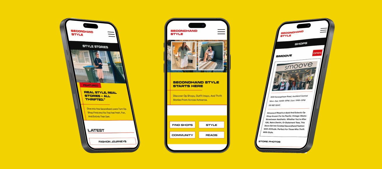
A mobile-first platform for op-shop discovery, NZ youth fashion stories and community profiles in one place.

Project type

Interactive web platform

Role

Solo

Timeline

8 weeks · 2025

Tools

Figma · VS Code · Photography

Secondhand Style
01 / Overview

A central place for Aotearoa op-shopping.

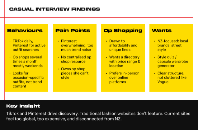
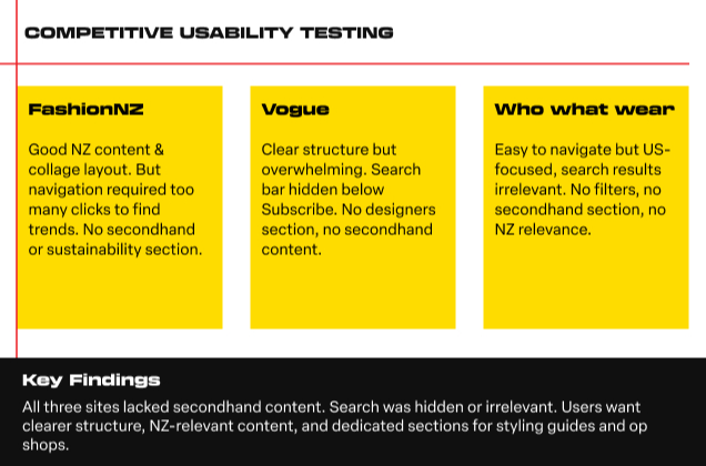
Secondhand Style is a mobile-first web platform bringing op-shop information, NZ-made style stories and community profiles into one digital experience. Existing fashion media focuses on overseas, high-end and unattainable standards — no central source exists for the people, places and looks that make up Aotearoa's secondhand scene.
02 / Problem

The gap in NZ fashion media.

Young people thrifting in Aotearoa have nowhere to go. Op-shop information, style inspiration and community are scattered across platforms — none built for them, none local.

HMW

How might we create a centralised, youth-focused platform that helps young people in NZ discover op shops, find relatable outfit inspiration, and engage with secondhand fashion?

03 / Research

What young thrifters actually want.

Six interviews with 18–25 year-olds, plus secondary research on NZ secondhand adoption and youth media consumption.

01

Time-poor users

They want quick, accessible information rather than deep dives.

02

Event gap

Struggle to find fashion content tailored to specific occasions.

03

No central guide

Nowhere to go for navigating NZ secondhand specifically.

04

Wants real people

Values relatable content from everyday people, not influencers.

05

Rabbit-hole problem

Finding fashion content is tedious and scattered across too many sources.

Research session 01
Research session 02
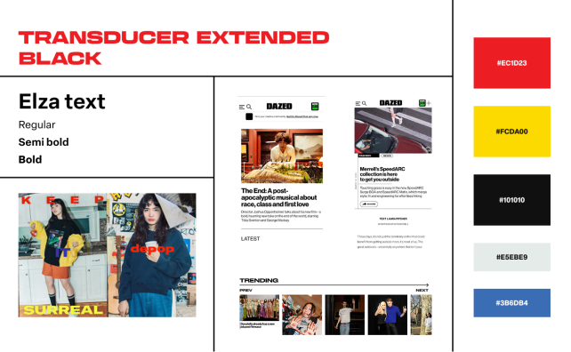
04 / Visual identity

Editorial, bold, and local.

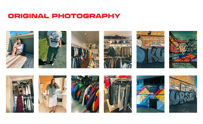
The visual identity draws from magazine culture, local youth fashion, and the messy-cool energy of secondhand shopping. Type-led, NZ-specific, real people over influencers.

01

Editorial

Type-led, not illustration-led.

02

Real people

Everyday outfits, not influencers.

03

Local first

NZ-specific, not global trend focused.

04

Bold type

A magazine voice on a small screen.

Moodboard
Photography direction
05 / Design process

From sitemap to working build.

Five stages from initial information architecture through to a coded, responsive front end. Each stage tested and signed off before the next one started.

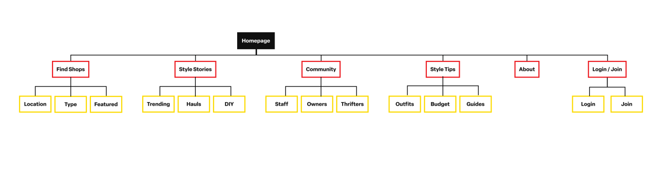
Step 01

Sitemap

Four main sections: Find Shops, Style Stories, Community, Reads.

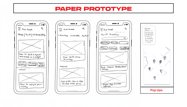
Step 02

Paper prototype

Directory structure and store-detail layout tested before digital prototyping.

Step 03

Brand design

Logo, palette, type and photography direction developed for the target audience.

Step 04

Wireframes

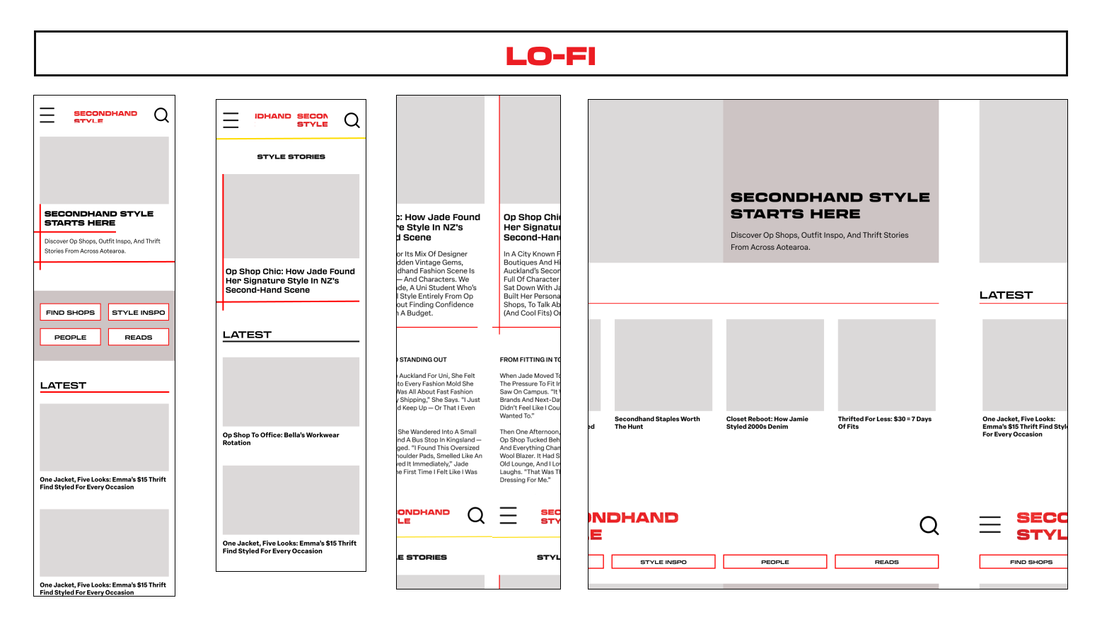
Low-fi to hi-fi in Figma to lock layout and flow before visual design.

Step 05

Front-end build

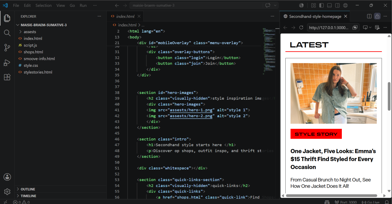
Coded in HTML / CSS / JavaScript. Mobile-first and responsive.

Sitemap
Paper prototype
Lo-fi screens
06 / Testing & iteration

Three users. Five tasks. Two friction points.

Usability testing with three participants completing five tasks on the prototype. Two clear friction points emerged, both fixed before the final build.

Friction 01

Style Inspo vs Style Stories

Quick link said 'style inspo', main nav said 'Style Stories'. 2 of 3 participants thought the section was missing.

Fix

Renamed the quick link to match the main navigation exactly.

Friction 02

Profiles → Community

Participants didn't know what to expect from 'Profiles'. 'Community' was suggested instead.

Fix

Renamed 'Profiles' to 'Community' and tagged article cards with community links.

07 / Outcome

A mobile-first platform with four cross-linking sections.

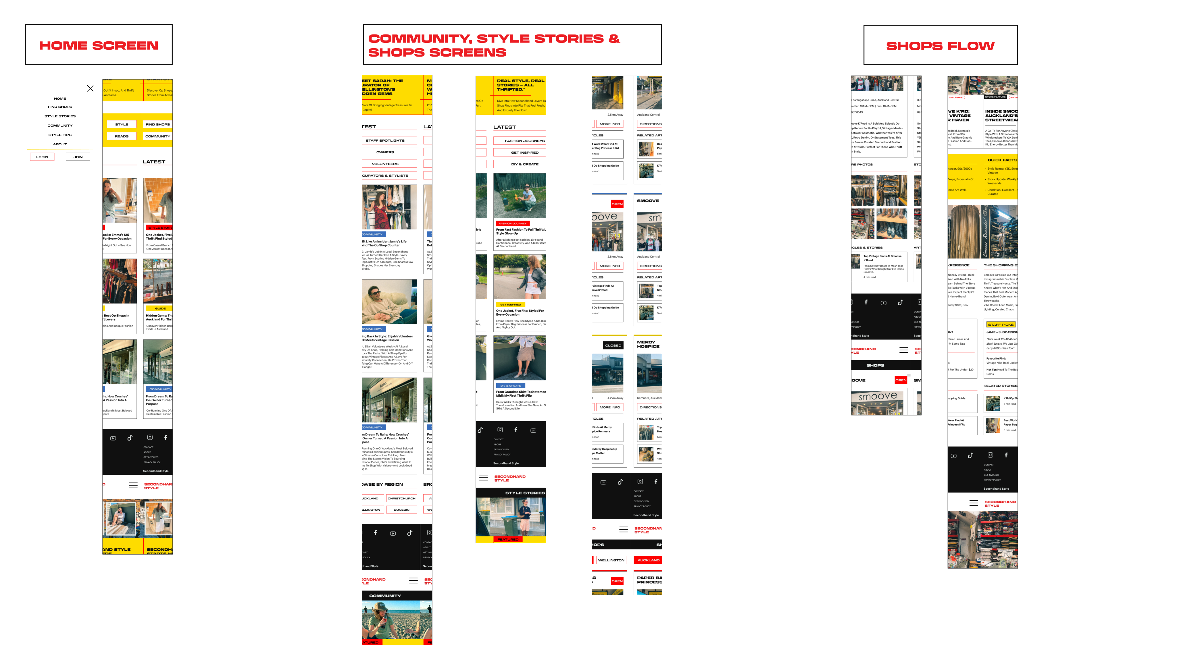
Find Shops, Style Stories, Community, Reads. Store pages link to related articles; articles link back to the shops they feature. A working front-end build in HTML, CSS and JavaScript, designed for 18–25 year-olds in Aotearoa.
Final screens
Front-end build
08 / Reflection

First build, bigger lesson.

This was my first attempt at making a functioning web design. I started with the idea of making a fashion website but through research I was able to define a more meaningful opportunity.

The project showed me that visual strength in an interface isn't enough on its own. Page designs need to allow users to immediately understand where to go and what each section provides. Testing showed that even small language decisions can have a big impact on how users navigate a site.

← Back to work
Project 03Product designLearning experienceMobile app2025

Inform.

A mobile learning app helping young gymnastics coaches build confidence through short, visual, practical skill resources.

Project type

App · UX + LXD

Role

Solo

Timeline

8 weeks · 2025

Tools

Figma · Interviews · Illustrator

Inform
01 / Overview

A learning app for gymnastics coaches.

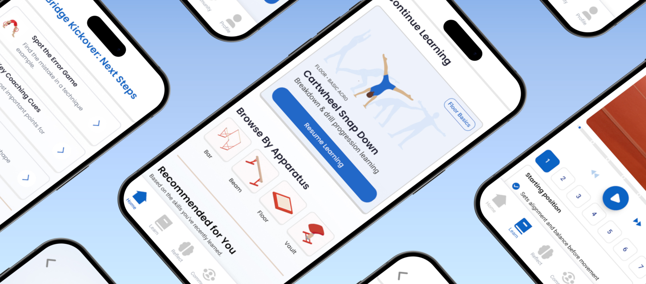
Inform is a mobile learning app concept helping gymnastics coaches access clear, visual, easy-to-use skill content while coaching. Young and part-time coaches want to improve their technical knowledge but long documents, scattered resources and formal course-style learning make it feel overwhelming.
02 / Problem

Not access but confidence.

The deeper issue isn't that resources don't exist. Coaches may understand the basics of a skill but feel unsure about what to look for, how to spot mistakes, or how to safely support gymnasts through progressions.

How might a mobile learning app support gymnastics coaches who are teaching themselves?

03 / Research

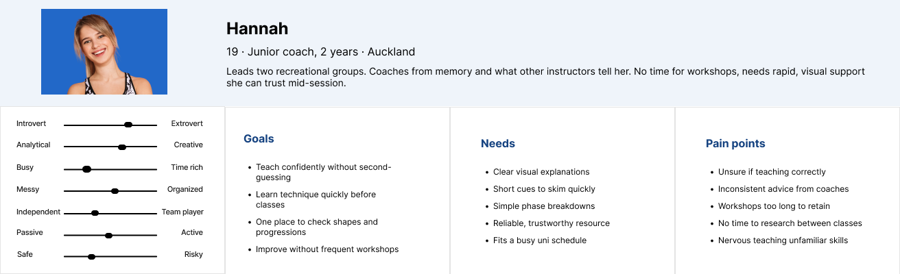
Talking to coaches aged 18–23.

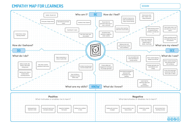
Desk research on learning experience design and microlearning, plus semi-structured interviews with young coaches balancing coaching with study and other commitments.

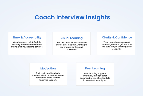
01

Visual examples win

Videos and images were easier to understand than written explanations.

02

Long reading creates friction

Coaches did not want to scroll through lots of text, especially mid-session.

03

Confidence depends on clarity

Resources had to clearly show progressions, shapes, and what good technique looks like.

04

Reflection supports learning

Interactive activities like spotting errors helped coaches think actively about technique.

05

Resources need to feel gym-specific

The visual direction had to reflect a real gymnastics environment, not generic education.

Research insights
Empathy map
Persona
04 / Design Direction

Gym-first, not generic.

The visual direction evolved to feel connected to gymnastics — mats, equipment, coaching spaces, movement — while staying practical and supportive, not childish.

Visual hierarchy around video

Video is the primary teaching tool. Everything else — overlays, cards, quizzes — supports it.

Clear mobile cards

Well-structured content coaches can scan fast, on their break or between rotations.

Gym-inspired colours

Drawn from equipment, mats and coaching spaces rather than a generic education palette.

Minimal text

Short, direct copy so coaches can absorb technique quickly during a session.

05 / Format Testing

Same skill, three formats.

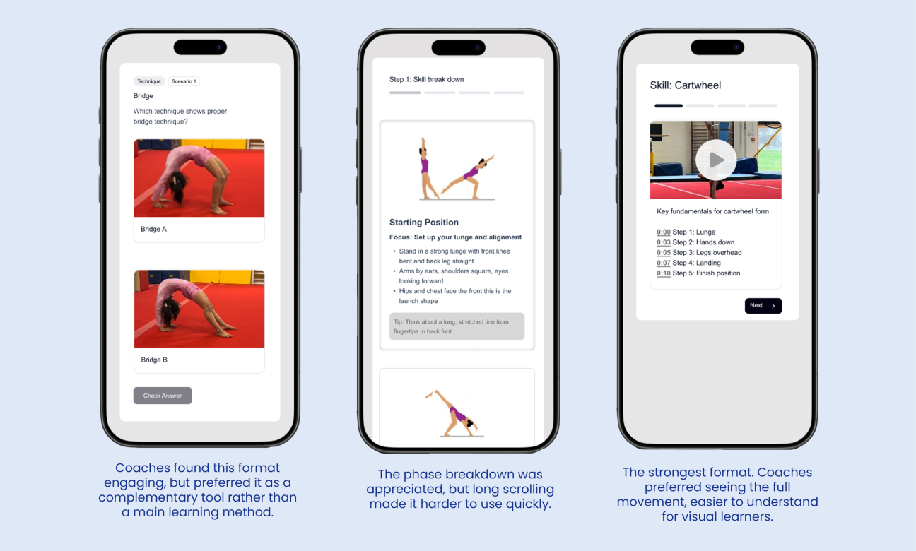
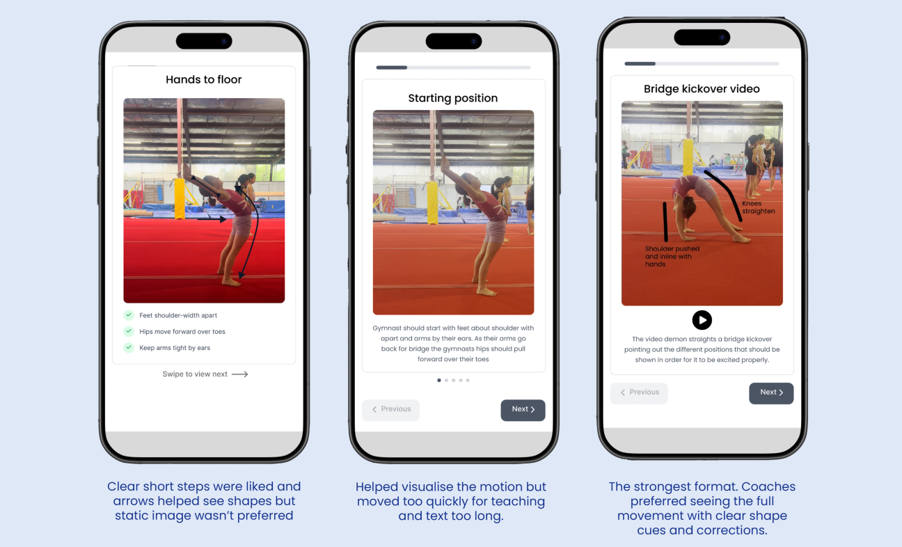
To define the best way to present coaching content, I tested three learning formats using the same skill, the bridge kickover. Each tested a different balance of speed, depth and interactivity.

Format 01

Video deck

Short video showing the full movement in motion. Coaches responded well and found it quick, clear, easy to reference mid-session.

Format 02

Step cards

Phase-by-phase breakdown using cards and written explanation. Useful structure but became text-heavy.

Format 03

Spot the error

Coaches identified mistakes from images. Engaging and reflective, but worked best as a supporting activity, not the core format.

Format test 01
Format test 02

Decision: Use video as the primary tool, supported by short overlays, phase cards and optional interactive quizzes — balancing speed, visual clarity, active learning and practical use in the gym.

06 / Final Outcome

A mobile concept built around bite-sized coaching.

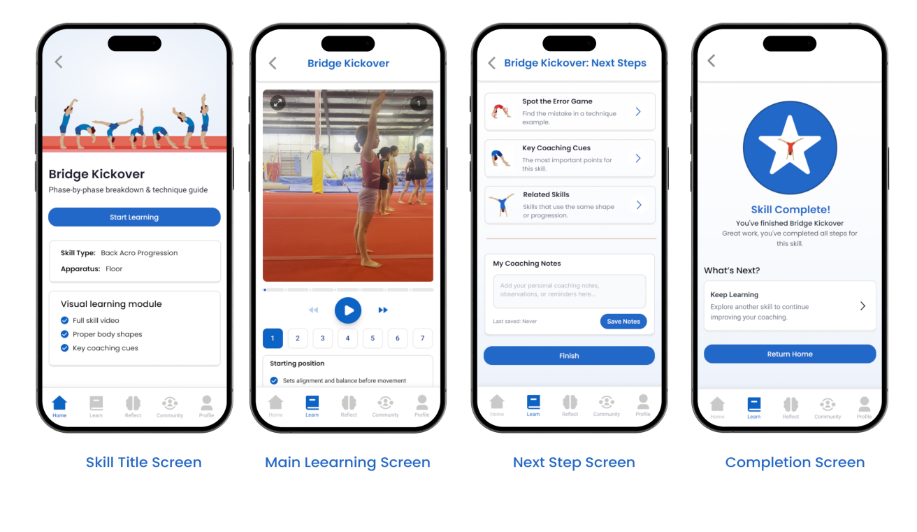
Video-first learning

Video is the main teaching tool. The full skill, in motion, in seconds.

Technique overlays

Short on-video overlays highlight key phases and shapes.

Phase breakdown

Skills broken into clear phases on supporting cards.

Spot the error

Interactive moments help coaches apply and retain knowledge.

Saved notes & recents

Coaches can quickly return to relevant content between sessions.

Related learning paths

Skills connect to progressions and drills across the system.

Final screens
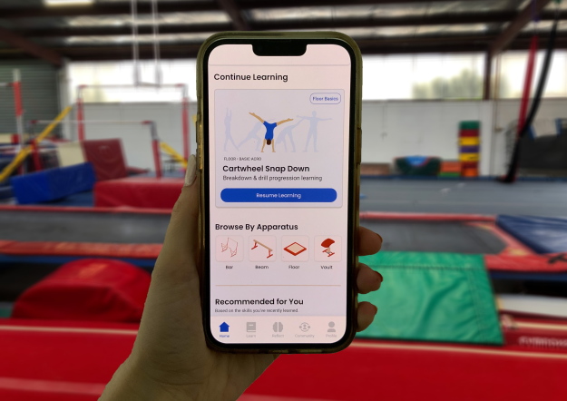
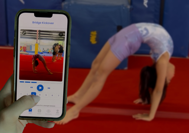
App in use at gym
App in gym context
07 / Reflection

Balancing detail with simplicity.

This project helped me understand how interactive design can support learning, confidence and professional development. The biggest challenge was balancing detail with simplicity. Gymnastics technique is complex, but coaches don't want to read long explanations while preparing for a session.

The strongest learning was that format matters as much as content. By testing three ways of teaching the same skill, I was able to make a more informed design decision and create an experience that better suited coaches' needs.

If I continued, I'd expand to more skills, test with coaches across experience levels, and explore how saved notes, class planning and progressions could support coaches over time.

← Back to work
Project 01Product designAI integrationMobile app2025

Common Ground.

A shared-living app that uses AI to help soften feedback between flatmates and make accountability feel less confrontational.
Project type

App · UX + AI

Role

Solo

Timeline

8 weeks · 2025

Tools

Figma · HTML/CSS/JS · AI API

Common Ground
01 / Overview

Designing for the emotional layer of flat life.

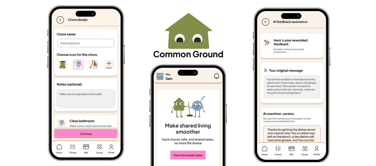
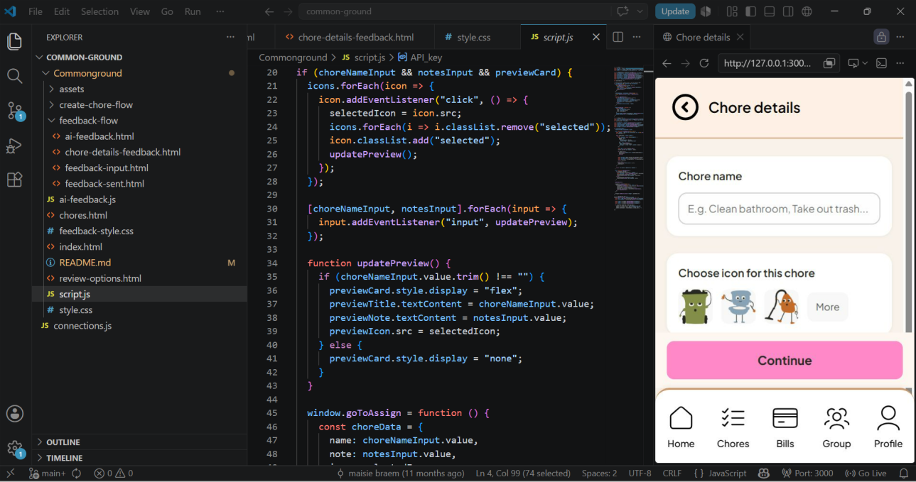
Common Ground is a mobile app that helps young flatmates manage chores, responsibilities and feedback without the passive-aggressive group chat. The problem isn't that people don't know what needs to be done but the feelings surrounding being asked, reminded, and being held accountable.
02 / Problem

Chores are not really about chores.

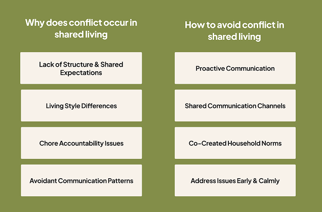
Flatmates often struggle with shared responsibilities not because the work is unclear, but because expectations and feedback are. That gap is where resentment, passive-aggressive messages and avoidable conflict are.
03 / Research

What actually causes flat tension.

Desk research was conducted on shared living dynamics, plus three semi-structured interviews with flatters about how they divide chores, raise issues and respond to household tension. These uncovered key insights.

01

Unclear expectations create tension

People assume everyone definitions of 'clean' or 'done' are the same.

02

Feedback feels personal

Raising a chore issue can easily sound like criticism, even when it isn't.

03

Accountability needs to feel shared

Users wanted structure, not a system that felt controlling or corporate.

04

Tone matters

The wording of feedback decides whether it lands as constructive or passive-aggressive.

Research notes
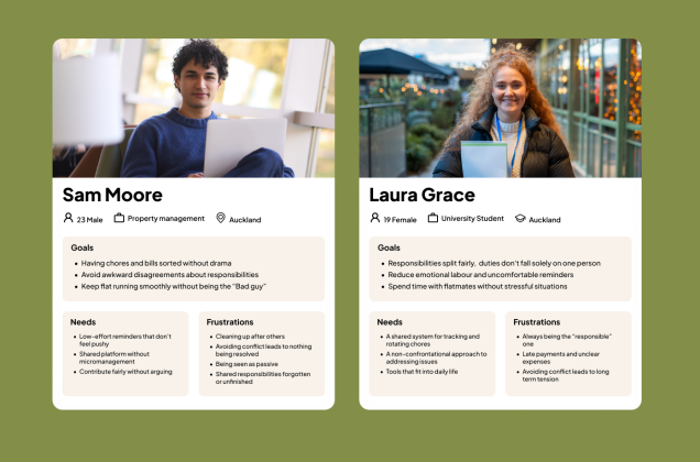
Personas
04 / Personas

Who I designed for.

Two personas built from interviews: a young professional and a university student navigating shared living for the first time. Both wanted fairness without confrontation.
05 / Design Direction

Four tones, one product.

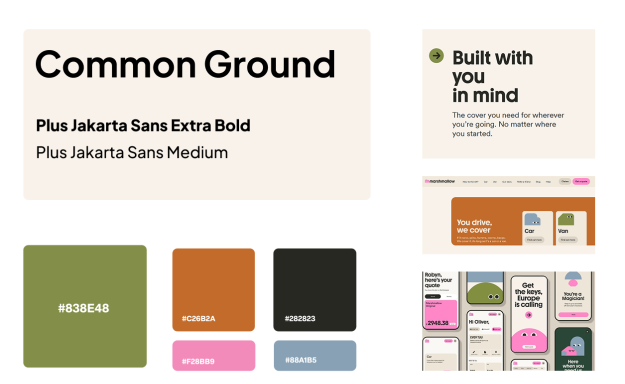
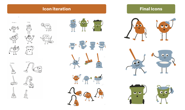
I built a moodboard to anchor the visual direction around friendly and playful rather than corporate. Character icons went through multiple rounds of iteration before landing on the final illustrated set.

01

Warm

Makes difficult conversations feel less intimidating.

02

Grounded

Reflects balance, fairness, shared responsibility.

03

Friendly

Avoids feeling bossy or overly formal/corporate.

04

Clear

Quick task management, allowing easy decisions.

Moodboard
Icon assets
06 / Approach

Paper first, pixels second.

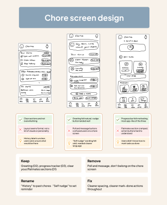
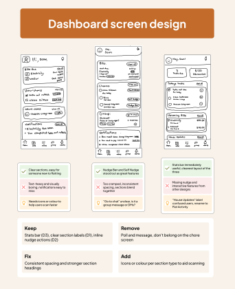
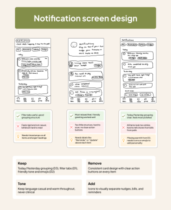
Low-fidelity paper prototypes were used to test core screens: chore creation, the dashboard, and the feedback notification, before committing. Quick to iterate, easy to change. User tested with three participants, three screen variations for each screen.
Chore screen prototype
Dashboard prototype
Notification prototype
07 / Design Strategy

Features that reduce friction.

During ideation, I explored features that support both practical organisation and emotional communication. The app needed to help users assign chores, track progress and give feedback, while still feeling friendly and low-pressure.

Chore tracking

A clear view of what needs doing, who is responsible and what has been completed, at first look.

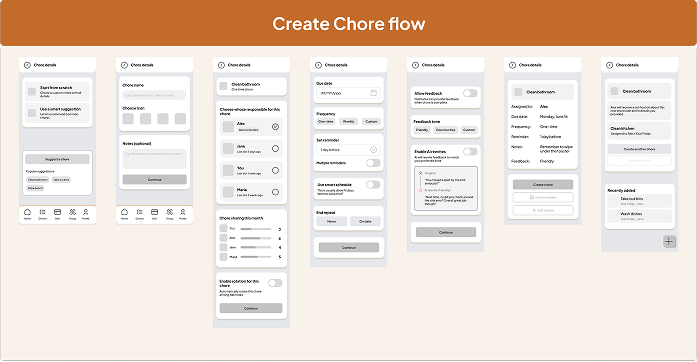
Smart chore creation

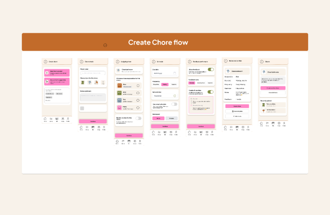
A guided setup flow for defining tasks with details, frequency and clear assignment.

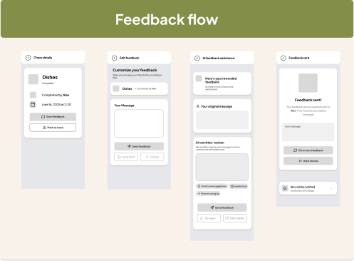
Feedback flow

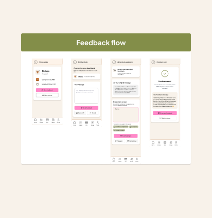
A structured screen to raise an issue without sending something impulsive or passive aggressive.

AI-assisted rewriting

The app rewrites feedback into constructive language before it's sent to a flatmate.

Feedback flow lo-fi
Create chore lo-fi
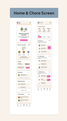
Home screen
Create chore
Feedback screen
09 / Testing

What reduced the pressure.

Prototype testing focused on the chore creation, assignment and feedback flows. The AI-rewriting feature and calm notification tone were the two standout moments. Users felt more confident that their message wouldn't read as mean.

01

Users valued guidance

A structured feedback flow made awkward communication feel manageable.

02

AI rewriting reduced pressure

Users had more confidence their message wouldn't read as passive-aggressive.

03

Clarity was important

Chore details and task ownership had to be immediately readable.

04

Tone shaped trust

Users responded better when app language felt calm, casual and non-judgemental.

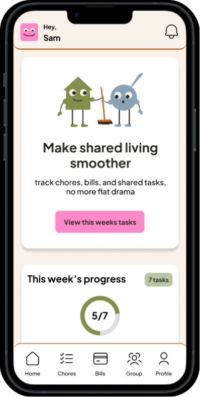
Final home screen
Front-end build
10 / Reflection

The reframe changed everything.

Common Ground showed me that product design isn't only about making tasks more efficient, it's also about designing for emotion, behaviour and social friction. The most important challenge was creating a system that encouraged accountability without making users feel judged. It was a great learning curve in intergrating AI API's into my product

What worked: Reframing chores as a communication and relationship problem changed the entire solution direction. The AI rewriting feature existed because of one research finding: 'feedback feels personal.'

What I learned: Tone, microcopy and interaction flow can significantly change how safe or confrontational a digital experience feels.

What I'd improve: Test with real flat groups over a longer period, and refine how reminders and accountability affect household behaviour over time.

← Back to work
Project 04 · In progress

femina f.

A feminist public installation on the Tiffany & Co building in Takutai Square, Britomart, pairing a generative p5.js LED facade with a physical poem-composition tray. Case study coming soon.

Under construction · Check back soon